Forrester reports that in the US,
45% of customers are more likely to abandon a purchase if they can't find an answer for their questions immediately.
About the Project
Finding the Solution
Alleviating the Burdens
Equipping the Buyer with More Information
Final Prototype
Reflection
Background
Due to the COVID-19 pandemic, many aspects of our lives have shifted more online – and shopping is no exception.
Online shopping comes with its own unique set of burdens due to the numerous options just at your fingertips. The brief my team and I chose was Social Impact of Consumer Choices. We wanted to address the growing dependency on online services for our everyday needs, specifically shopping.
The Problem
How can we present pricing comparisons directly to buyers on resale platforms to lower the burden of researching and evaluating prices within Depop?
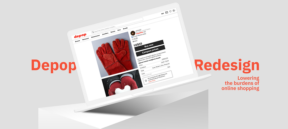
Why Depop?
Depop is a social and fashion e-commerce platform where users can buy and resell items.
We chose Depop because it is a widely used resale site and there is an even bigger burden of research when deciding the fairness of a secondhand item’s price.
I am a firm believer in thriting and reusing. I do wish to stay away from fast fashion just because of how detrimental it is to the environment. However, Depop’s current model allows for resellers to rack up prices and makes thrifting less accessible. It ends up deterring buyers from shopping sustainably. Depop’s user base is also more prone to being scammed or paying more because it’s hard to gauge the fairness of the price of a resold item. We hope this redesign will make it easier for users to find clothes within their budget whilst contributing to a sustainable economy, not deterring from it.
Understanding the Needs of Online Shoppers
We did user interviews and surveys to better understand the decision-making process of purchasing secondhand products online. We sent a Google form survey on various online communities.

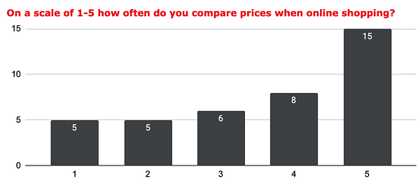
38.5% of survey respondents compare prices every time when online shopping.
Yet only 35.9% of survey respondents believe most sellers offer fair prices and deem them as trustworthy. It showed that respondents needed extra confirmation and still needed to do research to justify the item price–it is possible performing price comparison on their own helps increase their trust in the seller.
28.2% of respondents use Google as their main price comparison tool, either searching for the item, or utilizing Google’s shopping tab. This indicates users taking an extra step during their shopping process, adding the burden of research to their experience.

The Solution
We lowered the burden of research by presenting pricing information directly to buyers in a side-by-side comparison popup and an added pricing history feature.
The main features we redesigned are an addition to the already existing ones to give the users easy and quick access to the information they need without having to leave Depop.
The Personas
Now that we figured out the solution to our problem, we had to start thinking about the personas and who would be the potential users as well as their goals and frustrations. We conducted interviews with Depop users to create these personas:
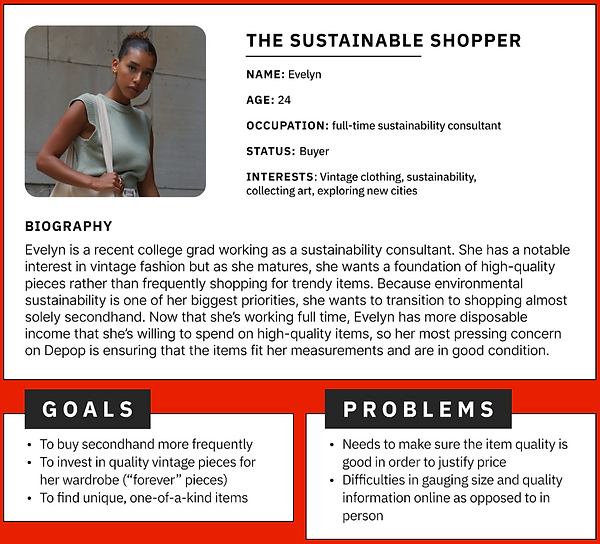
The Sustainable Shopper was inspired by interviewees who voiced interests in sustainable and ethical consumption as a motivation for secondhand shopping. Their frustrations show how they factor in item quality and sizing to their evaluation of an item’s pricing fairness.
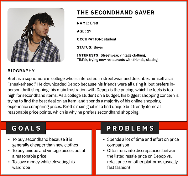
The Secondhand Saver reflects the interviewees who cited cost as their primary concern when shopping on Depop. Since 90% of Depop’s active users are under the age of 26, we wanted to show the budget constraints of a young adult. Our interview insights pointed towards price comparisons as a common practice when online shopping.
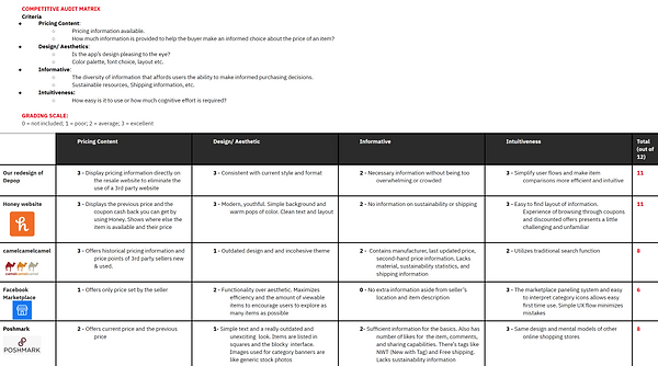
Learning from our Competitors
Knowing a general direction for our redesign and who we were designing for was great but it was not nearly enough to inspire confidence in the team to start wireframing and prototyping.
So to ensure we were ready to start ideating, we created a competitive audit matrix to analyze potential competitors and to also learn from them. We chose to compare against Honey, camelcamelcamel, Facebook Marketplace, and Poshmark.
We were most inspired by Honey’s use of a browser extension that would pop up directly on the page users were on as well as how they show you the same item being sold elsewhere and the differences in pricing. Another interesting feature was camelcamelcamel’s pricing history chart and the price points of third party sellers.
This analysis also made us more confident that Depop was the right platform as its design and intuitive interface was better than most. It also showed us that Depop needed to be more transparent and provide its users more pricing information in order to really stand out against competitors.
UI Sketches
Since we had a better idea of our redesign, we wanted to start visualizing it. I was responsible for making the UI sketches and wireframes so that we had a foundation to start prototyping.
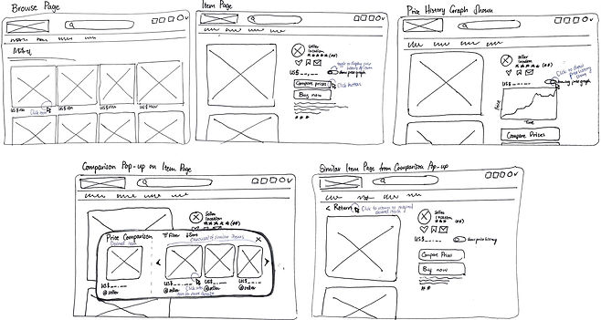
Low-Fidelity Prototypes
We created two possible low-fidelity prototypes of our redesign on Figma. The entry point will be the browser page.
We wanted to minimize the steps and screens needed for the user to gauge the fairness of a price so we played around with pop-ups. We also wanted to address the user concerns on comparing similar items among e-commerce and so we designed to provide a price checking tool that is intuitive and easy.
.png)

Feedback on Low-Fidelity Prototypes
Users preferred Option 2 because of its consistency with the existing mental model of Depop so keeping it as close to Depop is vital. Users also expressed the need for easy access (pop-up) to price comparisons when deciding on the price’s fairness.
Next Steps after User Feedback
We decided to make the high-fidelity prototype as a mix of the two options with Option 2 being the main design but adding on the features like pricing history and related items on the bottom of Option 1. We will ensure to implement the high-fidelity prototype that is similar to Depop’s interface and keep the price comparison extension tool within the item page so that the user don't have to exit out the page.
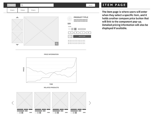
High-Fidelity Prototyping
We made our high-fidelity prototype and conducted more user testing. We gained some valuable feedback which we used to improve our redesign. The browse and item page remain unchanged:

Changes made after User Feedback

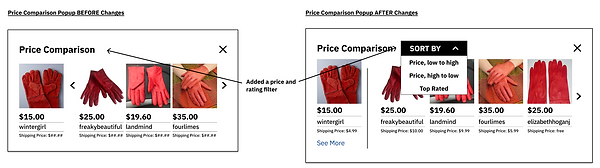
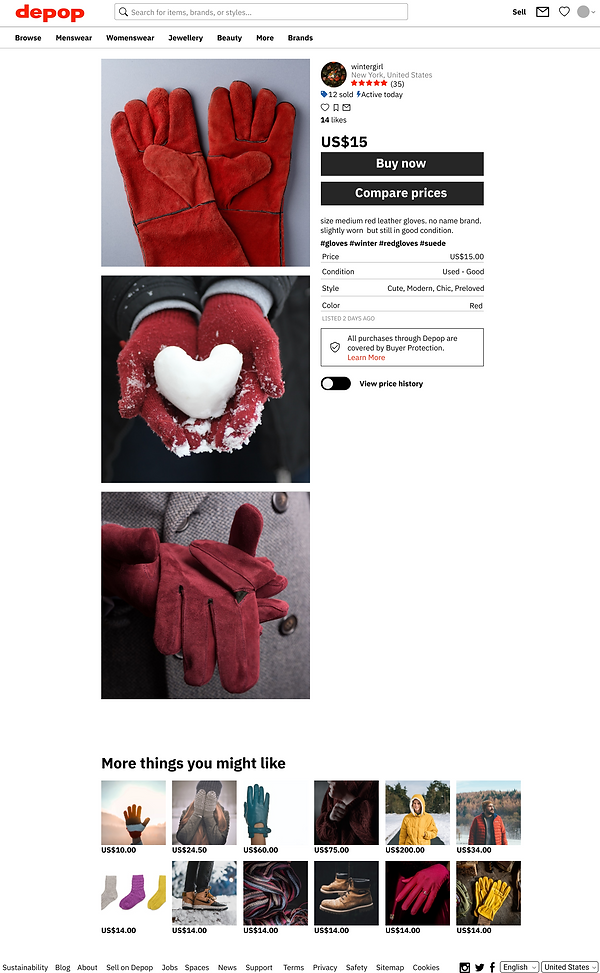
We added a “See More” button to provide the users the option to see more details like ratings, item condition, and brand name. Some users found that having too much information displayed would be too overwhelming but having it there did help inform them on their purchasing decision so we opted for a less invasive approach by only showing more necessary information if they want to see it. We also implemented a “Sort By” filter to display the items in different ways.

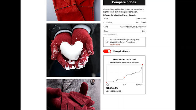
According to users, the pricing history graph was a nice feature to have but lacked sufficient information to be useful so we added a short description under the title to better explain what the graph was showing. A hover function was added to show significant price changes over time (red dots) to make it more interactive.
Here is our finalized prototype that I am very proud of ^_^
Price Comparison Pop-up Tool

Price History Graph
Future Plans
We chose to keep the tool within Depop because it would give us valuable insight on a specific subset of resale buyers (small-scale) which will help us validate our findings and stay focused. However, we believe the tool can expand to other resale sites since there is no other product out there. The tool can definitely expand to compare with other platforms across the internet. We chose to not include the comparison of resale with fast fashion just yet because that would distract us from our goal of improving sustainable shopping practices. The tool, however, shows promise of being applied on any online site. We also designed to benefit the users and less about bringing profit to the platform.
The hope of the tool is to standardize pricing transparency and prevent markups on resale platforms to make thrifting accessible again and so we will know we succeeded when users are able to decide quickly whether something is overpriced or not.
Conclusions
This redesign will be adopted across many e-commerce platforms and transform online shopping by equipping buyers with a tool that allows them to quickly compare items. This will standardize pricing, prevent markups, and make online shopping more transparent. I am so grateful for my team and my mentors that allowed me to be a part of a project that really challenged me and made me a better designer.
Key Achievements
The beauty of the project is that we were able to give and receive feedback throughout. Here are but a few positive reactions from our incredible peers and mentors:
