
Pixley's Oddities in one sentence
An Inclusive, Femme, Queer, and Non-Binary Art Space for Curiosities, Tattoos, and Piercings
About the Project
Redesign Objectives
Design Process
Creative Brief
Low-Fidelity Prototyping and Functional Specs
Website Development
Final Design
Reflection
Overview and Background
We worked with a client, the owner of a small business called Pixley’s Oddities, to redesign their shop’s website. We made sure to understand their goals, needs, and opportunities to meet functional requirements and provide a working final design proposal.
.
What does Pixley's Oddities do?
Pixley’s Oddities is a retail space for alternative art and taxidermy, offering tattoo and piercing services along with art workshops and an “oddities” shop. As an inclusive, femme, queer and non-binary art space, Pixley’s serves as a departure from the traditionally white and male-dominated tattoo and piercing community.
.
Why Pixley's Oddities?
We chose to work with Pixley's Oddities because it is a small business that stands for inclusivity, especially to femme, non-binary, and queer individuals. We wanted to help them by redesigning their website because it would mean so much to us to support them in any way that we can. I personally align with Pixley's Oddities because I, too, strive to empower those in margenalized communities like the LGBTQI+ community.
It was also an exciting challenge to take on. The business, the shop, and what they all represent are very unique. They combine elements of morbidity with playfulness and so to successfully convey this in our redesign was not going to be easy but definitely a fun challenge.
What did Pixley's Oddities want?
Pixley’s Oddities already has an existing website that offers customers the ability to book appointments, view classes, and shop.
This is their current website: https://pixleysoddities.com/
We met up with the client a few times to get to know the business and what we could do to help. From the initial meetings, we concluded that the redesign will:
-
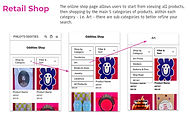
Promote the retail shop to be more apparent and appealing to users
-
Display classes or workshops and their details in a more accessible and exciting way
-
Improve the appointment process to be easier to navigate for users
The priorities for the redesign were as follows:
-
Visual design that intertwines nostalgic, morbid, and whimsical elements
-
Stick to hot pink and blue as primary colors
-
Emphasize the brand’s commitment to inclusivity and acceptance
Understanding the Customers
After finalizing our redesign objectives and priorities, we started to research and interview the target users of the website. From the data we obtained, we established three personas who would likely interact with the Pixley's Oddities website:


Using the personas, we created user scenarios and cases to explore the motivations and context of using the website all to better understand the customer in relation to the client.
Competitive Analysis
We ran a competitive analysis on possible competitors and their websites. We focused on businesses that provide similar services. Guru Tattoo specializes in tattoos, Sideshow offers tattoos and piercings, and Enigma specializes in piercings. Little Dame and Memento Mori have similar brands as Pixley's. We compared the websites on the criteria of Branding, Features and Functionality, Site Architecture, and Content.
Branding

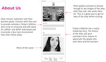
Pixley's Oddities has a unique story compared to similar businesses. Like Sideshow's emphasis on their story, we will also include Pixley's Oddities business purpose and history on the home page. Enigma, Sideshow, and Little Dame include photos of their storefront and interior. We will also include images of Pixley's in our redesign to make the website more informative and acquaint new customers.
Features and Functionality

All competitors had an About Us page and a way to contact the business so it was necessary to add these features into our redesign. We were inspired by Little Dame and Guru Tattoo in how they go about their retail shopping experience and booking process.
Site Architecture

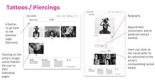
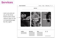
After competitive analysis of site architecture, we knew that the primary navigation labels should be organized by service type - Tattooos, Piercings, Classes, Oddities. The footer should involve some sort of navigational function too. Analysis also showed that the website should be consistent and minimal to avoid decision fatigue for users.
Content

Image galleries are commonly used and are effective in helping customers familiarize themselves with the business or an artist's work. Business information like contact details, location, hours, and social media were also seen across all competitors so we deemed it necessary to include this in our website's content.
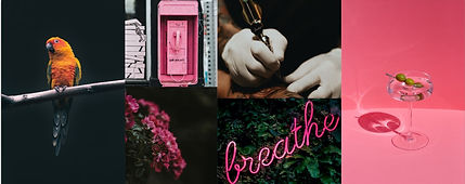
Moodboards
We created three distinct moodboards based on the keywords that our client wanted to emphasize: Playful, Alternative, and Creative.
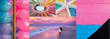
Playful
Alternative
Creative

Playful centered around Pixley's main colors of hot pink and light blue to emulate optimism, freedom, and childlike nostalgia. Alternative channeled the darker mystique whilst still using hot pink as an accent. Creative contained retro elements that were slightly disturbing and pop art-esque. We showed these to the client and they really liked the colors of Playful, but they liked the mood of Creative.
Creative Brief
We sent our client a creative brief with a definition of potential product, scope, audience, objectives, personality and tone, key target audience insight, anticipated problems, and sketches. This creative brief was to ensure that the client understood and agreed to the requirements and expectations of the project.
Definition of Potential Product
Given the client's approval, the definition of our potential product became:
"The Pixley’s Oddities website redesign will be an online embodiment of their unique brand, various services, inspiring story, and safe inclusive space. This will be done through balancing the morbid with the fun and playful to establish an even deeper relationship with the customer"
Sketches
The sketches gave the client an idea of the direction we were heading with the mobile version of our redesign.

The client was overall very pleased with the suggested redesigns so we were confident enough to start building the website.
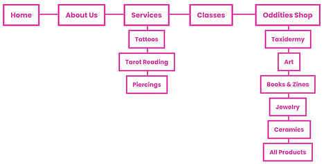
Site Architecture
We blueprinted the hierarchical structure of our website and its pages to ensure navigability.
Low-Fidelity Prototype
Taking the site architecture and the approved sketches, we started low-fidelity prototyping the mobile and desktop version of our website redesign.


Functional Specs for Mobile
We then detailed out the functional specifications of the mobile website to make sure that every design decision had a reason and that the design and development team were on the same page.


Functional Specs for Desktop
Functional specifications for the desktop version accounted for what was going to be best suited for a desktop environment.


User Testing
We conducted user tests with the low-fidelity prototype with various user tasks and questions for the mobile and desktop version. Users found our design was straightforward and easy to navigate which was a refreshing change from other tattoo and retail sites. It was helpful to have the artist's portfolio on the site. A suggestion was given to include a search bar and shopping cart functionality which we will add in our next iteration.
Development Plan
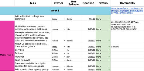
Before we started developing our high-fidelity prototype, we made a development plan to keep track of our progress and delegate tasks. This was crucial to our success as we were all working remotely.
First High-Fidelity Prototype and User Tests
We prototyped the mobile and desktop versions of our redesign on Figma following the specifications given by the client. We played around with different stylistic choices and when we were happy with the overall aesthetic, we conducted user tests to see what we needed to improve on before we could present our final prototype to our client.


We got feedback from our mentors, peers, and fellow classmates. We curated the common critiques and possible implementations into a table to see what changes we needed to make in our next iteration:

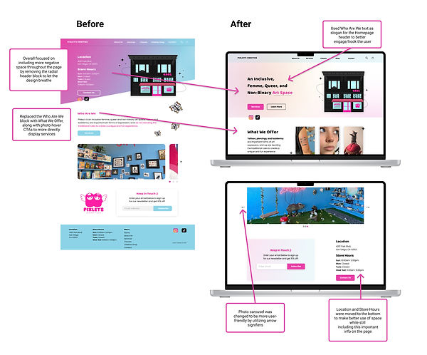
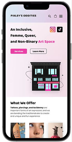
Before and After
Here are some of the revisions and improvements we made:
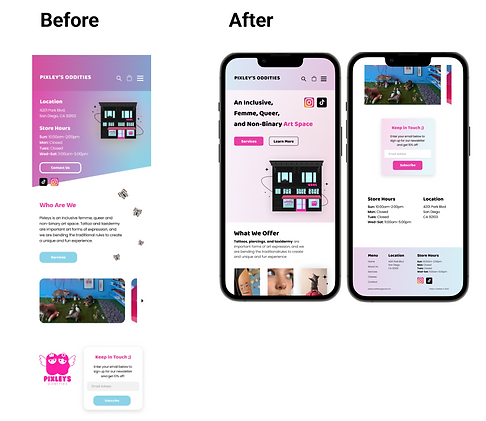
Made changes to the color scheme and optimized how we used the negative space to improve the look and feel of the website and to ensure it balanced playfulness and morbidity.
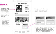
We removed the radial header and placed the Who Are We text as the opening slogan on the home page to hook in the user. We also added arrows and dots to the photo gallery to act as signifiers. We realized scrolling through a photo gallery on a mobile is very different to a desktop so we designed each to best follow the mental model of users. Touch screen scrolling for the mobile and clicking on the arrows or dots for the desktop.
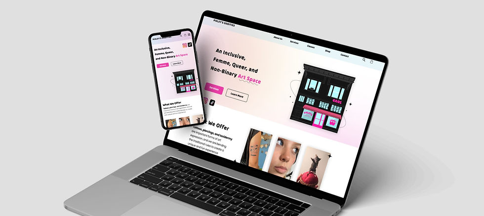
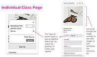
Final High-fidelity Prototype
After iterating our design for the final time, we were very satisfied with the results. We sent our final prototypes to our client. They were very happy which made us all very happy too!

Mobile Website
Desktop Website

Conclusions
Working with a client was so rewarding. Even though we were not able to develop this design into a working website, the prototypes we designed did inspire our client to make revisions to their current website. They took inspiration with emphasizing the services more and adding a photo of all the employees on the home page. Being able to inspire them showed we did have an impact. Our client did express potentially collaborating on other design projects with us in the future. I would say the project was a big success!
Challenges and Limitations
One of the biggest challenges we had was to portray Pixley’s unique mission statement and values on the website. Meeting deadlines and producing good quality work within the time constraints of the 10 week project also proved to be a challenge which presented limitations on how many user tests we could perform. Despite this, we were able to take the data given and played to each of our strengths to produce a great result.
Key Achievements and Takeaways
As the project lead and main point of contact with our client, I learnt about the social dynamics that arise between client and designers and how to effectively communicate to adequately meet everyone's needs. We were very lucky with our choice in client because they were really responsive and provided us with all the necessary content in a timely manner so working with the right client is also very important.
We achieved what we set out to do which was to help a small business and seeing Pixley's Oddities's website undergo changes after we sent over our redesigns just goes to show we did assist them in some way. I really believe in what Pixley's Oddities stands for and the space they provide for margenalized communities. It has inspired me to carry on working in projects that I am passionate about because it produces work that is so much more meaningful. I plan to collaborate with Pixley's Oddities once again in the near future!